Try our video maker at Animoto.
I created this animoto video to answer a number of questions in relation to my intended audiences interests, hobbies and likes.Wednesday, 24 October 2012
Thursday, 18 October 2012

These items of clothing are pictures I have gathered which reflect the style I would like to portray in my music video. I am hoping that when I film the weather will be warm and sunny and I would like the girls in the video to wear floral dresses/playsuits, high waisted shorts or skinny jeans and vest tops with trainers such as vans or converse. For the campfire scene (later at night) we will wrap up as it will be colder. I have suggested a leather jacket, parka or hoody. The clothing I have chosen I feel will demonstrate a young/fresh/fashionable look.
Friday, 5 October 2012
Video Inspiration
I love One Directions 'Live while we're young' music video as it portrays the idea of friendship and fun. I like the idea of the camping atmosphere. The use of the tent and swimming pool are good ideas.
Fairground ideas
I intend to shoot a section of my music video on a fairground, most likely South Shields fair. It has a variety of rides and is located right on the beach so it is convenient as I also want to shoot on the beach and in the sea. Below are some images of fairground rides which I intend to go on with friends and shoot for frames in my music video to portray the idea of fun!

I would like to go on a big ride such as this to capture us screaming and having a laugh.


I love the idea of water zorbing as it is fun and will look interesting in my video. I am currently researching into water zorbing in Sunderland.

This is another ride I feel would look effective in my video, particularly at night because of the flashing lights.
G325 section 1B: Analyse one of your productions in relation to language
In this essay I am going to analyse my AS coursework. This is a music magazine consisting of a front cover, contents and double page spread and the genre I chose was indie/rock. My cover story is the debut of a new band 'Bleeding Mascara' which I created myself for the purpose of my coursework. Throughout the making of my piece, I tried to make sure my magazine looked authentic and original.
The theory of structuralism began in France in the 1950's and is the belief that things cannot be understood in isolation. Instead, they have to be seen in the context of the larger structures they are part of or the 'bigger picture'. One way we can understand this is by looking at semiotics, a theory created by Barthes. His theory studies the 'science of signs' which demonstrates that the meaning is derived through signs, specifically the signifier and the signified. An example of this is the colour blue, the colour is what we see (therefore the signifier) and the meaning or representation is peace, serenity and calmness (or the signified).

The front cover uses a range of colours which I specifically selected to appeal both to a male and female audience. The sell line is in red bold font and signifies danger, 'Bleeding Mascara' is centred and is also in red to signify blood and relate to the band name. I chose to enlarge the word 'insane' and make it bigger than the rest of the text to signify the idea of alarm and shock. I also changed the font and rotated it to separate it and draw particular attention to it. The font I chose has a rushed look to it asif it has been splashed accross the page, almost like blood. This is what I wanted it to represent. I feel the pose that the cover model is adopting signifies mystery as her facial expression is very bland.
 The black and white images I have used in my contents signify darkness and rock. The contrast of the black and white could signify the idea of life and death as new life and purity are often represented by the colour white and black is often a symbol of death and darkness. The instruments used in the shots signify live music being played and I feel the body language of the artists is appropriate to the indie/rock genre. The largest image of the cover model Jade is quite interesting as she is looking directly at the camera signifying confidence and even possibly dominance, as the lead singer of the band.

The theory of structuralism began in France in the 1950's and is the belief that things cannot be understood in isolation. Instead, they have to be seen in the context of the larger structures they are part of or the 'bigger picture'. One way we can understand this is by looking at semiotics, a theory created by Barthes. His theory studies the 'science of signs' which demonstrates that the meaning is derived through signs, specifically the signifier and the signified. An example of this is the colour blue, the colour is what we see (therefore the signifier) and the meaning or representation is peace, serenity and calmness (or the signified).

The front cover uses a range of colours which I specifically selected to appeal both to a male and female audience. The sell line is in red bold font and signifies danger, 'Bleeding Mascara' is centred and is also in red to signify blood and relate to the band name. I chose to enlarge the word 'insane' and make it bigger than the rest of the text to signify the idea of alarm and shock. I also changed the font and rotated it to separate it and draw particular attention to it. The font I chose has a rushed look to it asif it has been splashed accross the page, almost like blood. This is what I wanted it to represent. I feel the pose that the cover model is adopting signifies mystery as her facial expression is very bland.
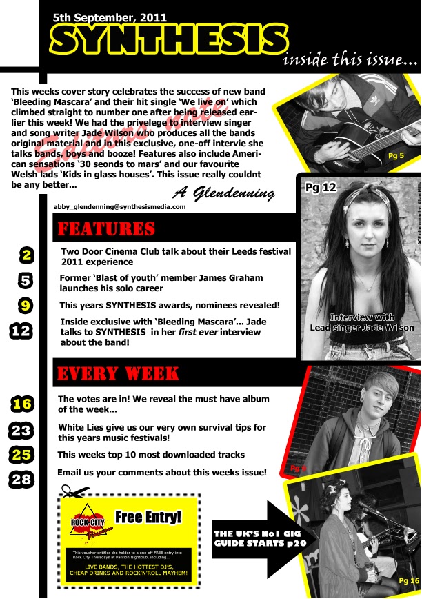

The use of red on the double page spread is very significant as the band are named 'Bleeding Mascara' and the font is red to signify blood. The body language of the small image of Jade in the top right corner could signify darkness and depression as her hair is covering her face and she is looking down. This could also relate to the name of the band as Jade could be crying. I have positioned the images of the band members on the left of the spread over larger white rectangles to represent polaroid pictures. I think this is effective as it shows the band in action. The image of Jade on the centrefold could signify mystery as her facial expression is very neutral and she is looking back asif she is coaxing the audience to follow her.
After studying my AS coursework piece, I can conclude that the theory of structuralism applies to my magazine and by understanding semiotics I have allowed myself to see the bigger picture in order to analyse my piece thoroughly and effectively.
Subscribe to:
Comments (Atom)