Monday 10 December 2012

CD cover inspiration

I like this cover as it is simple and does not look overcrowded. I particularly like the colour coordination     
of the font and cheryl's outfit. I find the use of blurring on the image very creative and interesting.

This is the back of one of Cheryl's album covers. I particularly like the script type font and the wooden effect of the background.

Thursday 6 December 2012

Photo editing

This image of my friend Alysha is exactly what i'm looking to capture in my own image at the studio shoot. I have considered using Alysha as my cover model.
 This is the original image of Alysha which i used to experiment with on a photo editing website. I like the use of selective focus as the blurred effect in the background allows Alysha's facial features to stand out. 
I chose to make the image black and white as I thought it would be effective to highlight some features in colour. I coloured her eyes bright blue and found this made the image look almost hypnotising. I also coloured her lips pink to add a touch of femininity.

Thursday 22 November 2012

Cover inspiration

I was drawn to this cover because of the simplicity and beauty of it. I particularly like the use of the black and white image with the white roses which stand out. l also like the script type font as I think it compliments the piece perfectly and looks very feminine. I also like the pose Cheryl is adopting, it is simple but elegant.

This cover appealed to me because of the burst of pink against the black and white. I also love that Nicki's skin appears to have a radiant glow. The use of stripes across the image looks particularly effective because part of the image is in colour and the other part in black and white. I found the choice of font interesting because of the contrasting bold, large font which appears to dominate the cover and the pink font which allows a touch of femininity and balance.

Applying theory to my product

Narrative structure

My music video will follow a linear structure in that it will have a clear beginning, middle and end. The narritive within my music video will take place over the course of one day. I intend to introduce the characters in my video at the beginning, on a morning, when they all meet up for a day out at the beach/fair. The following events will include driving to the destination, going on fairground rides and going onto the beach. My video will conclude with the characters camping on the beach with a small campfire. It will be dark so that the audience can recognise it is night time.

The use of fragmented structure will also be evident in my video as I won't necessarily put the narrative in the correct order aslong as I establish the morning and night at the beginning and end of the video. I will probably jump back and forth between the clips of the fairground and the beach.

Barthes codes

The Proairetic Code- any action or event that indicates something is going to happen.
In my video, the idea of the girls getting dressed and preparing their camping equipment indicates they are going to go camping.

The Semic Code- connotation within the story which gives additional meaning.
The idea of the girls going out together and having fun connotes the idea of friendship.

The symbolic code- meaning arises out of opposing or conflict ideas.
In my video, there will be a clear contrast between day and night, this demonstrates the idea of the symbolic code.


Wednesday 24 October 2012

Audience study

Try our video maker at Animoto.

I created this animoto video to answer a number of questions in relation to my intended audiences interests, hobbies and likes.

Thursday 18 October 2012

These items of clothing are pictures I have gathered which reflect the style I would like to portray in my music video. I am hoping that when I film the weather will be warm and sunny and I would like the girls in the video to wear floral dresses/playsuits, high waisted shorts or skinny jeans and vest tops with trainers such as vans or converse. For the campfire scene (later at night) we will wrap up as it will be colder. I have suggested a leather jacket, parka or hoody. The clothing I have chosen I feel will demonstrate a young/fresh/fashionable look.

Friday 5 October 2012

Video Inspiration

I love One Directions 'Live while we're young' music video as it portrays the idea of friendship and fun. I like the idea of the camping atmosphere. The use of the tent and swimming pool are good ideas.

Fairground ideas


I intend to shoot a section of my music video on a fairground, most likely South Shields fair. It has a variety of rides and is located right on the beach so it is convenient as I also want to shoot on the beach and in the sea. Below are some images of fairground rides which I intend to go on with friends and shoot for frames in my music video to portray the idea of fun!

I would like to go on a big ride such as this to capture us screaming and having a laugh.
I think it would be a good idea to go into a fun house and shoot one another playing around and laughing.
I love the idea of water zorbing as it is fun and will look interesting in my video. I am currently researching into water zorbing in Sunderland.

This is another ride I feel would look effective in my video, particularly at night because of the flashing lights.

G325 section 1B: Analyse one of your productions in relation to language

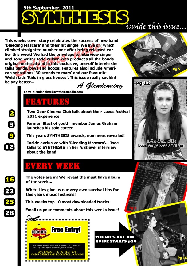
In this essay I am going to analyse my AS coursework. This is a music magazine consisting of a front cover, contents and double page spread and the genre I chose was indie/rock. My cover story is the debut of a new band 'Bleeding Mascara' which I created myself for the purpose of my coursework. Throughout the making of my piece, I tried to make sure my magazine looked authentic and original.

The theory of structuralism began in France in the 1950's and is the belief that things cannot be understood in isolation. Instead, they have to be seen in the context of the larger structures they are part of or the 'bigger picture'. One way we can understand this is by looking at semiotics, a theory created by Barthes. His theory studies the 'science of signs' which demonstrates that the meaning is derived through signs, specifically the signifier and the signified. An example of this is the colour blue, the colour is what we see (therefore the signifier) and the meaning or representation is peace, serenity and calmness (or the signified).


The front cover uses a range of colours which I specifically selected to appeal both to a male and female audience. The sell line is in red bold font and signifies danger, 'Bleeding Mascara' is centred and is also in red to signify blood and relate to the band name. I chose to enlarge the word 'insane' and make it bigger than the rest of the text to signify the idea of alarm and shock. I also changed the font and rotated it to separate it and draw particular attention to it. The font I chose has a rushed look to it asif it has been splashed accross the page, almost like blood. This is what I wanted it to represent. I feel the pose that the cover model is adopting signifies mystery as her facial expression is very bland.

The black and white images I have used in my contents signify darkness and rock. The contrast of the black and white could signify the idea of life and death as new life and purity are often represented by the colour white and black is often a symbol of death and darkness. The instruments used in the shots signify live music being played and I feel the body language of the artists is appropriate to the indie/rock genre. The largest image of the cover model Jade is quite interesting as she is looking directly at the camera signifying confidence and even possibly dominance, as the lead singer of the band.

The use of red on the double page spread is very significant as the band are named 'Bleeding Mascara' and the font is red to signify blood. The body language of the small image of Jade in the top right corner could signify darkness and depression as her hair is covering her face and she is looking down. This could also relate to the name of the band as Jade could be crying. I have positioned the images of the band members on the left of the spread over larger white rectangles to represent polaroid pictures. I think this is effective as it shows the band in action. The image of Jade on the centrefold could signify mystery as her facial expression is very neutral and she is looking back asif she is coaxing the audience to follow her.

After studying my AS coursework piece, I can conclude that the theory of structuralism applies to my magazine and by understanding semiotics I have allowed myself to see the bigger picture in order to analyse my piece thoroughly and effectively.

Friday 14 September 2012

Inspirational album covers

I like this cover as the close-up stands out against the white background. I also like the font and how its colour contrasts with the light picture.

I like this cover because it is so simplistic. I think the extreme close-up is very effective as Selena's pale skin contrasts with the pink heart on her lips. I also like how the font is in the top right corner and like how the white compliments the dark background of her hair. I also think the idea of the & symbol (and) being made to look like a heart is creative and clever, it also gives the cover a feminine look.

I particularly like this cover because of the bright coloured background. The medium shot of kelly in her black jacket contrasts perfectly. I like how her lips are pink to compliment the background. I also like the centred font which is in simple capital letters. I love the idea of the album name gradually fading from yellow to white then to pink.


Tuesday 28 August 2012

Inspirational texts


This is Kesha's video for 'Take it off'. I feel it portrays the idea of fun and I love the use of colour. I like that there are a number of people involved and I am considering a similar idea for my piece.


This album cover is simplistic and evokes the idea of friendship.

I like the use of the closeup against the plain background with the artists name in the centre. I also like the font.

A2 Proposal and Pitch

Proposal
The brief I intend to pursue is the promotion package for the release of an album, to include a music promo video together with a cover for its release and a website homepage for the band/artist.

For my music video, I had the idea of myself and my friend Jamie recording a song. Jamie is a close friend of mine with whom I have been involved in talent competitions therefore I thought it would be a good idea to record one of our duets. As artists, I do not want us to come accross to the audience as a couple therefore I have had a challenge choosing an appropriate song.

Pitch
Initially, the song I wanted to record is called 'Alone' by Heart an American Rock band, also later sang by Celine Deon. The song is a love song and therefore I thought an appropriate setting to record the video would be the beach. One of the reasons I am unsure about this song choice is that I do not want the artists to come accross as a couple but instead very close friends. Another song I thought about recording is Owl City and Carly Rae Jepsons 'Good Time'. In contrast this is not a love song it is a song that portrays friendship and having a good time. I wanted to get a group of friends together to record this video in a nightclub (on a night time) or again on the beach, in the sea (during the day). I feel these ideas are stereotypical and will give my ideas more thought.

The genre I intend to use is 'pop' therefore my second song choice is more suited. I am undecided about the narrative however I either want to use the theme of love in which case my first song would be appropriate or friendship in which case I would use the second song.


For my album cover I have thought about taking a range of different photos of myself and Jamie adopting different poses and making a collage effect cover. Another idea was a close up of myself and Jamie with a black background. I liked the idea of a long shot walking into the sea with the album name on an angle in the corner in script type font however I do not feel this reflects the genre I want to use. I want the idea of fun to come accross on my cover therefore I liked the idea of myself and a group of friends against a white background covered in multicoloured paint. Although the idea is completely random it was inspired by Kesha's music video 'take it off'.

I want my homepage to be colourful and fun with ways to download songs, get gig tickets and download free posters to print out. I have looked at numerous band homepages including http://www.onedirectionmusic.com/gb/home/ and I particularly liked its simplistic layout with one large central image and information around it.


AS Reflection

Reflecting back on my AS media coursework I feel I successfully made a realistic music magazine and am proud of my piece. I feel I incorporated everything I intended too looking back at my plan and think the genre I wanted to portray is evident.

Throughout the making of my magazine I have learned alot about photoshop and other different media forms including blogger and feel that in the future I will be much more confident handling a similar task.

The grade that I recieved overall for my Media AS was a C and I feel I was let down on the written aspect i.e the examination. I feel that creating my magazine was definitely the part of the course I feel I did better with.

I feel that my magazine was a good magazine although there are areas which I could have improved on. If I was to do the task again I would probably have used different colours instead of keeping the same colour scheme throughout. I would probably have experimented more with the fonts as I feel some of the fonts I used I did not like.

I was happy with the aspects of the magazine I had taken from other magazines or inspirational texts. I felt they added a realistic effect to my magazine and portrayed an authentic indie/rock feel. I particularly liked the list of bands I used on the front cover which I had taken from NME.

Most importantly I feel I would improve my organisation as this added stress when creating my coursework. Overall I think I handled the task well and feel I have learned alot from doing so.